SignIn Component
Lesson 14 Chapter 3 Module 2
How we build new components will generally follow the same pattern:
- Create a directory
- Create a file in that directory with name of a file
- Add boilerplate (template) code from below (note that Button import is not necessary, just left as an example)
- Build the component
import React from 'react'

import { makeStyles } from '@material-ui/core/styles'
// Material UI Components
import Button from '@material-ui/core/Button'
const useStyles = makeStyles((theme) => ({
root: {
},
}));
export default function SignIn() {
const classes = useStyles()
return (
)
}
First thing we're going to build is our Sign In component. It will look like this when finished:

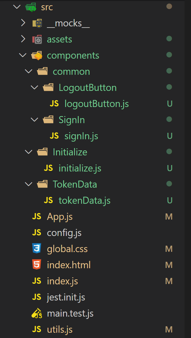
We want to keep our code organized, so in your src directory, create a directory called components. Inside that, we'll create another directory called common and finally inside that a directory called SignIn. Inside that directory, you'll add a file called signIn.js - that's where our component code will go, so open it up and add in the boilerplate code from above.

The image on the right will help you visualize the directory structure we want to create. Note that this isn't set in stone. You can organize your code anyway you like in whatever kind of directory structure you like. What I've outlined seems to be the way many developers set things up.
The component directory houses all our components. The common directory houses components that might get used in many places around the Dapp. The other component directories outside of common house more complex/unique components.
Again, no hard and fast rule on this. If there is something that makes more sense to you - feel free to change it up.
Let's start building the component.
Again, we start off by importing the things we need for the component. In reality, when you build these things, it's a back and forth effort - you'll add something to the return section of the code (a button, grid, card, piece of information, etc...), then add the import or other times you know you need a button or something, add the import then go down and code it out in the return section.
No matter how the imports get done, in order for the Dapp to run, you'll need to import everything you might need to reference or use or you'll get errors - either way - you'll eventually have your imports section built out properly.
In our SignIn component, we need the functionality provided by the login function in utils.js. Likewise, we need the Material-UI styling functionality provided by makeStyles and the specific Material-UI components listed.
import React from 'react'

import { login } from '../../../utils'

import { makeStyles } from '@material-ui/core/styles'
// Material UI Components
import Button from '@material-ui/core/Button'
import Paper from '@material-ui/core/Paper'
import Card from '@material-ui/core/Card'
import CardMedia from '@material-ui/core/CardMedia'
import CardHeader from '@material-ui/core/CardHeader'
import CardContent from '@material-ui/core/CardContent'
import Grid from '@material-ui/core/Grid'
import Typography from '@material-ui/core/Typography';
import LockOpenTwoToneIcon from '@material-ui/icons/LockOpenTwoTone';
The next section does what a .css sheet normally does - defines the class styles we want to attach to various elements in the component. It resembles css but isn't quite the same. In general you can't use hyphens and need to put things in quotes. For example, max-width is css, maxWidth is the equivalent here. margin: auto works in a css file, margin: 'auto' is equivalent here.
const useStyles = makeStyles((theme) => ({

    root: {

        flexGrow: 1,

        maxWidth: 300,

        margin: 'auto',

        marginTop: 50,

        minHeight: 1100,

    },

    paper: {

        padding: theme.spacing(2),

        textAlign: 'center',

        color: theme.palette.text.secondary,

    },

    customCard: {

        maxWidth: 600,

        minWidth: 275,

        margin: 'auto',

        padding: 20

    },

    media: {

        height: 140,

      },

    button: {

        margin: theme.spacing(1),

      },

    }));
Next up, we name our component and mark it as default and exportable. That is followed by definition of a classes constant that incorporates the styles we just defined above so we can attache them to elements with a classes.button or classes.customCard type of format.
export default function SignIn() {
const classes = useStyles()
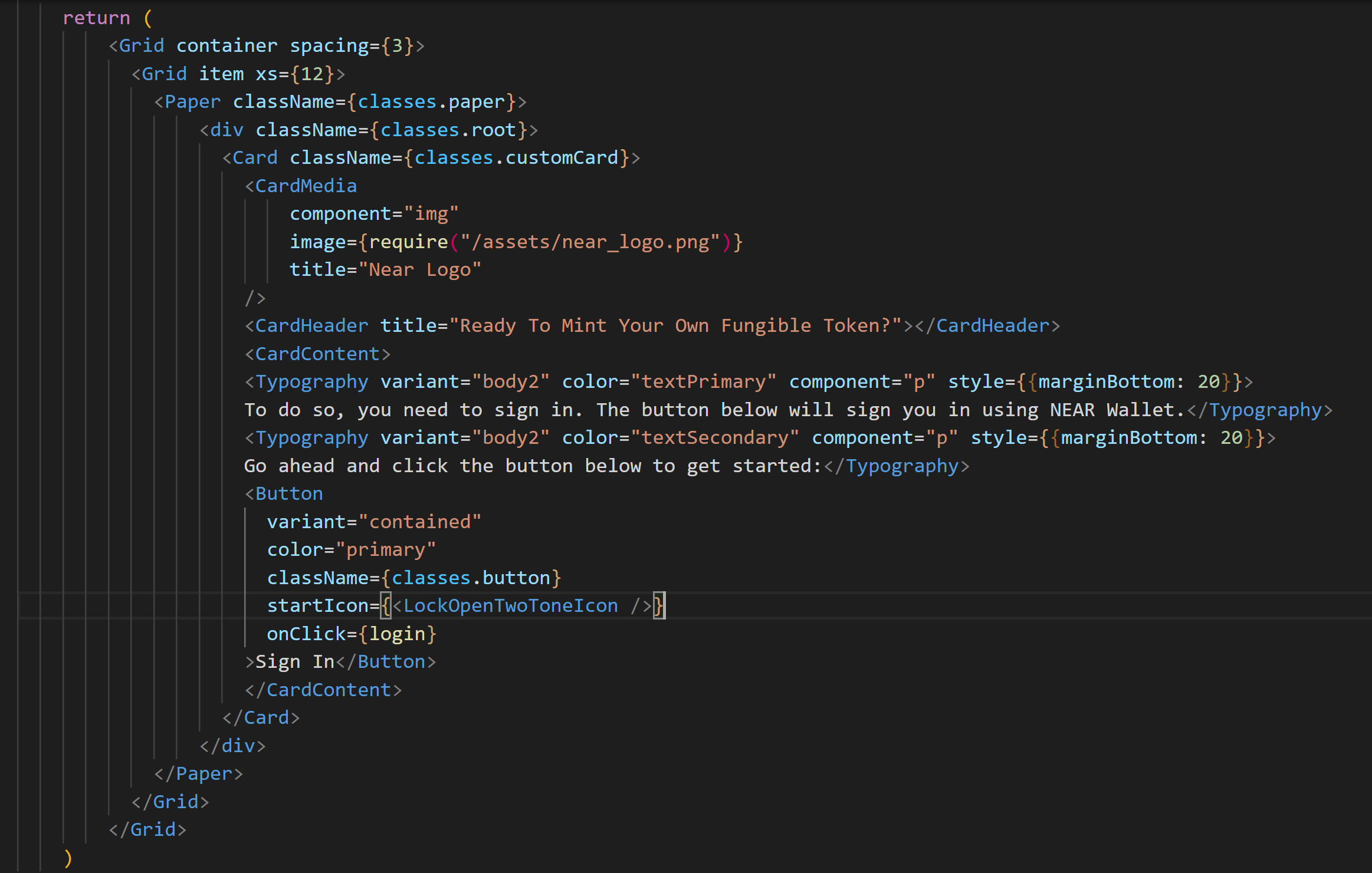
The last thing in our SignIn component is the return section. This is what actually gets displayed on the screen - structure, styles and related functionality.

I don't want to go off on a tangent and start talking about how to set up Material-UI components. I pointed you to the Material-UI component library when we set it up - you'll need to do a little research/experimenting to understand how to properly add them to your components - typically a copy/paste affair, but you may have to modify the styles defined above somewhat to make everything work in your Dapp.
In our SignIn component, we are first defining a Grid with some spacing and saying it's supposed to use all 12 columns on a xs screen (again, this will mean nothing to you if you aren't familiar with how Material-UI divides up the screen or manages different sized screens). Inside that we are putting the Paper theme component and the thing I want you to pay attention to is the className={classes.paper} part of that.
Above in the styles section we defined some css like properties for paper. Those are now being applied to the Paper component by using className={classes.paper}. Similarly, other elements have classNames and corresponding properties attached that influence their visual representation on screen.
Next we add a customCard element that has the NEAR logo, a header title ("Ready to Mint Your Own Fungible Token"), some content, and a Sign In button. That Sign In button is composed of a Button element and a LockOpenTwoToneIcon element.
That's it - when all is said and done - that code provides the sign in screen along with the sign in button that allows us to sign in to the Dapp with our NEAR account. The login function redirects us to the NEAR wallet to authorize the Dapp to use our account.
Congratulations - you've built your first React component. The beauty of React is that you can reuse these components in this Dapp or any other ones you create. Over time, you can build up a library of your favorite components and plug n play to create amazing Dapps.
Next up, the Initialize Component.
